VIP
Your Content Goes Here

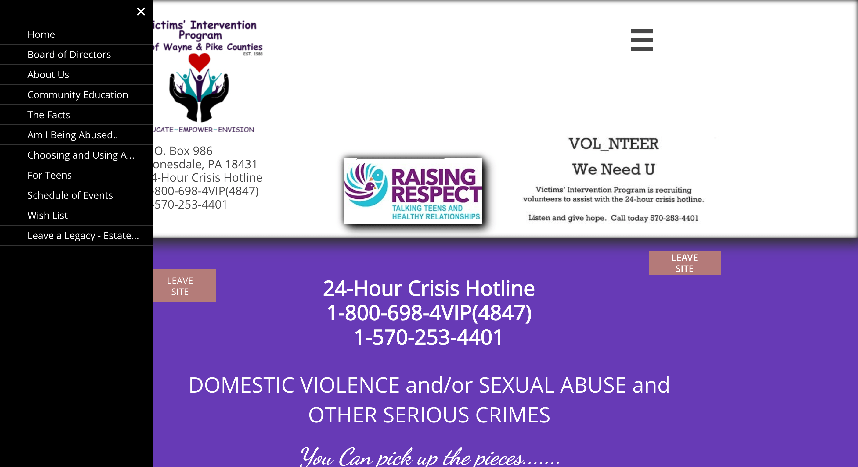
VIP
Since 1982, Victims’ Intervention Program, now VIP, has been educating the Wayne County community on the issues of domestic and sexual violence, empowering victims and survivors to make the best choices for their individual situations, and inviting the community to envision a world free from violence.
The organization started as a crisis center serving victims of sexual and domestic violence only. Very quickly they realized crisis services were not enough and added individual and group counseling services as well as prevention education. As time went on, they knew that helping with the crisis was only the beginning. They needed to do more. The question on the table for VIP’s team was “What happens after the crisis?” As a result of this question, many post-crisis programs and services were born.
Over the years, VIP began to provide services in Pike County; however, they were not the only organization providing those services. In late 2019, they became the only provider in both Wayne and Pike County, but did not have the name or brand recognition in Pike County that was needed to serve those in need of their services.
THE NEED
It’s always tough for people to see the forest before the trees. When you’re in the day-to-day of running a business or organization, oftentimes you’re too busy doing the routine to think about or strategize your brand and its future. More often than not, in nonprofits that is the norm. They spend so much time trying to make their dollars go even further than their counterparts; a for-profit business.
For Victims’ Intervention Program, they realized their brand needed a refresh, as well as a new website and marketing in general, but really didn’t know where to start. It’s a big undertaking and overwhelming for any organization, but more so when you’re a 30-year-old nonprofit that hadn’t had a budget for it.
As fate would have it, the paths of our two companies crossed. As part of our mission to work on projects that feed our soul, Katrina just so happened to reach out to them for a cross-promotion with another KKPR client. A professional match made in heaven, Katrina hit it off with the Executive Director of Victims’ Intervention Program after an introduction by their Board President, a long-time colleague of Katrina’s.


DESIGN AND CAMPAIGN
Being that VIP is a long-standing nonprofit, rebranding was a delicate subject, especially for those that had been with the organization since the 80s. We started off slow and respectfully with interviews, questionnaires, and presentations that involved the entire VIP team, including their Board of Directors. With all their feedback, we were able to get a solid understanding of the organization, as well as the people they serve to lead us in a solid direction for the task at hand.
Knowing the changing dynamic of the region they serve, as well as where they wanted to go as an organization, posed a challenge we were eager to tackle. We wanted to focus on this task while allowing ourselves the creativity to let the project take us wherever it might lead.

The biggest question for all of us was, “What’s the future mean to VIP?” It means that society is always changing; sexual orientation, gender identity, and their fluidity wasn’t a thought in 1982, and today, it’s a part of nearly every conversation. The changing landscape of funding sources for the services VIP provides also wasn’t a conversation, but today it is. Developing an inclusive brand look that could speak to all their audiences, old and new, was our primary goal, and with the right creative freedom, it led down roads we gleefully hadn’t anticipated.
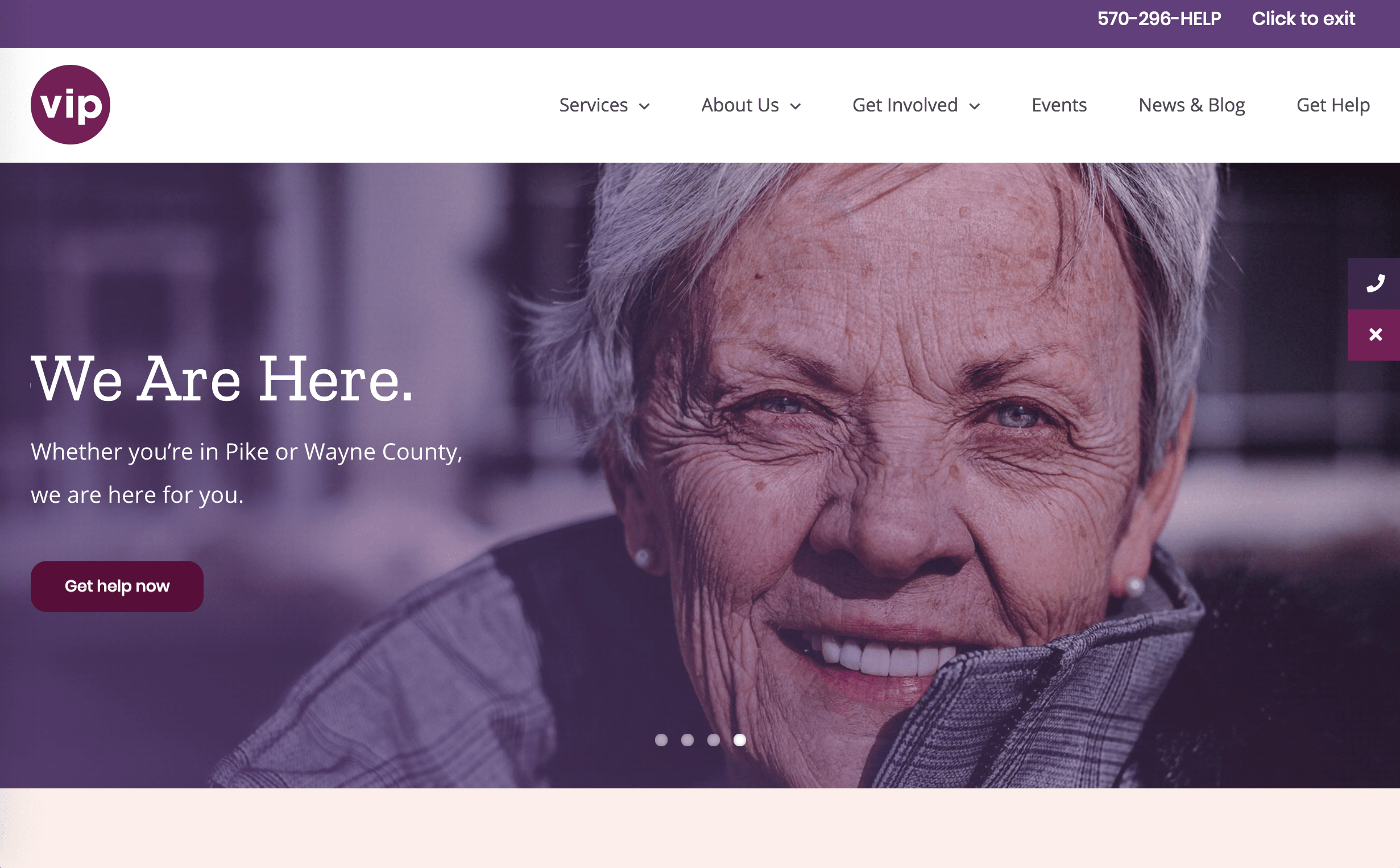
With the future of VIP at the heart of the project, the best course of action was to build off the base of what they’ve done best for 30 years. This meant to us that visually, we could modernize the brand through copy and imagery to grow the awareness of who they’ve always been there to support. The non-gender specific logo and a color scheme that removes itself from a sea of purple and teal, start to paint VIP in a new light; a nonprofit who is modern, open to all, and prepared to tackle the future.
“We Are Here” happened by chance…a serendipitous chance. Chosen originally as a place holder on some graphics for the branding campaign, it quickly became the only choice as we talked through the many ways that VIP is there for its constituency. It also set the stage for the initial project to sprout legs and take off into a whole new direction.

With the excitement of the new look and branding campaign, the two camps – VIP and KKPR – quickly allowed the creativity to flow to fundraising product designs. The development of branding-based pieces evolved from that phrase, along with a few other fun graphics that supported VIP’s message of empowerment, which launched their online store endeavor.
Partnering with a local screen printing and embroidery company, we were able to create a partnership between the companies that helps VIP spread awareness while raising money for their services in a fun way for people of all income levels to get excited about. All proceeds of the shirts are donated to VIP and email addresses collected from the purchases of those products will begin to build their email database for future marketing efforts.
Enlisting the help of a few brand ambassadors to help spread the word, a few digital advertising campaigns, and a whole lot of marketing genius, Victims’ Intervention Program is now known as VIP.

THE OUTCOME
A new name and brand were agreed upon as the starting point for this project, but it quickly led to how VIP communicated that brand, especially from a digital perspective. The best part of this rebrand was the expansion that it took because of the passion and creativity that flowed between VIP and the KKPR Team.
Our love for VIP’s mission led to new, creative ways for them to raise money and awareness, and the synergy between the two companies made the rebrand fun and rewarding for everyone that worked on the project.